by Gail Rieke
White turns to black/ black turns to white
The Japanese design concept of Notan
is the balance between light and dark elements.
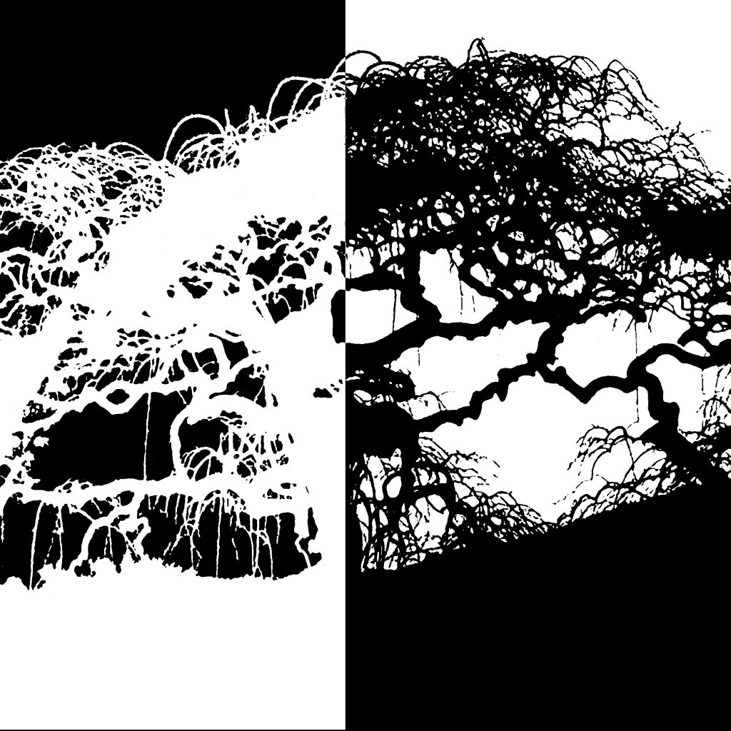
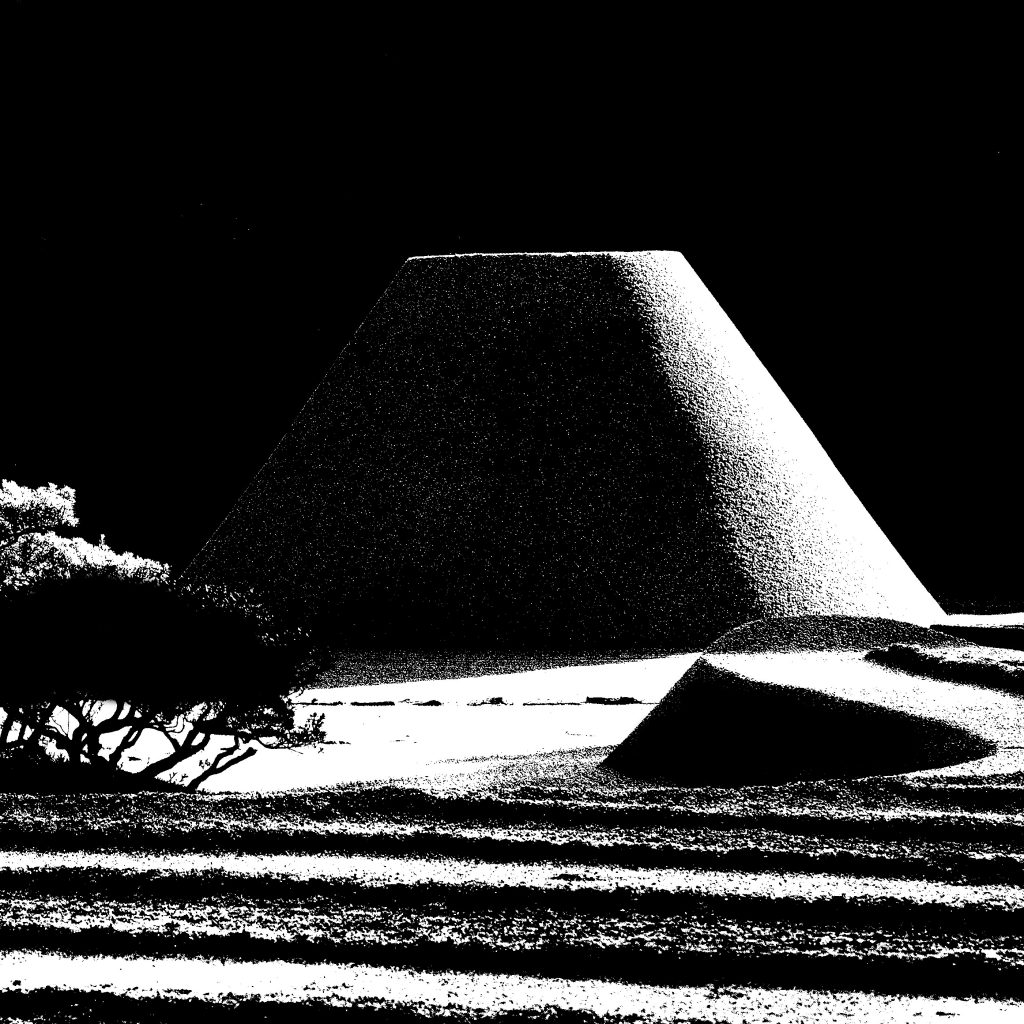
Adachi Garden in Yasugi
It demonstrates the idea that the image and the ground
or the positive and the negative spaces are of equal importance
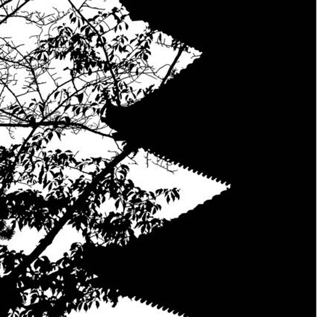
Toji Pagoda in Kyoto
It uses flat shapes to create a dramatic image
that is easily comprehended and remembered.
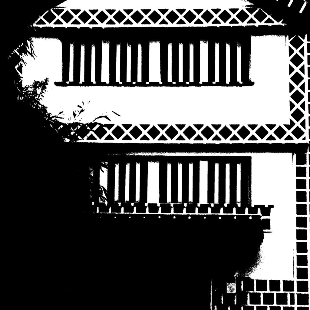
Kura (storehouse) in Kurashiki
It emphasizes pattern.
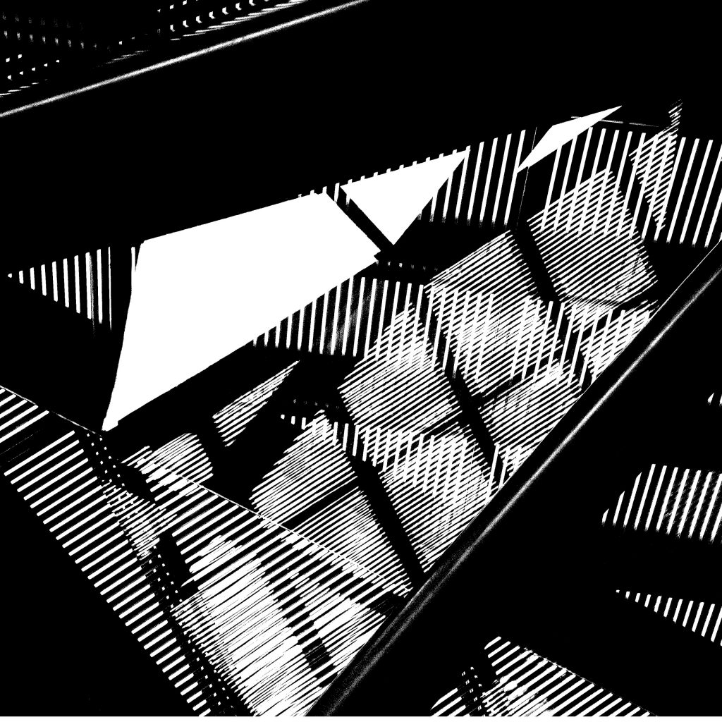
Windows and shadows at the Miho Museum in Shigaraki
It accentuates the contrast of geometric and organic shapes
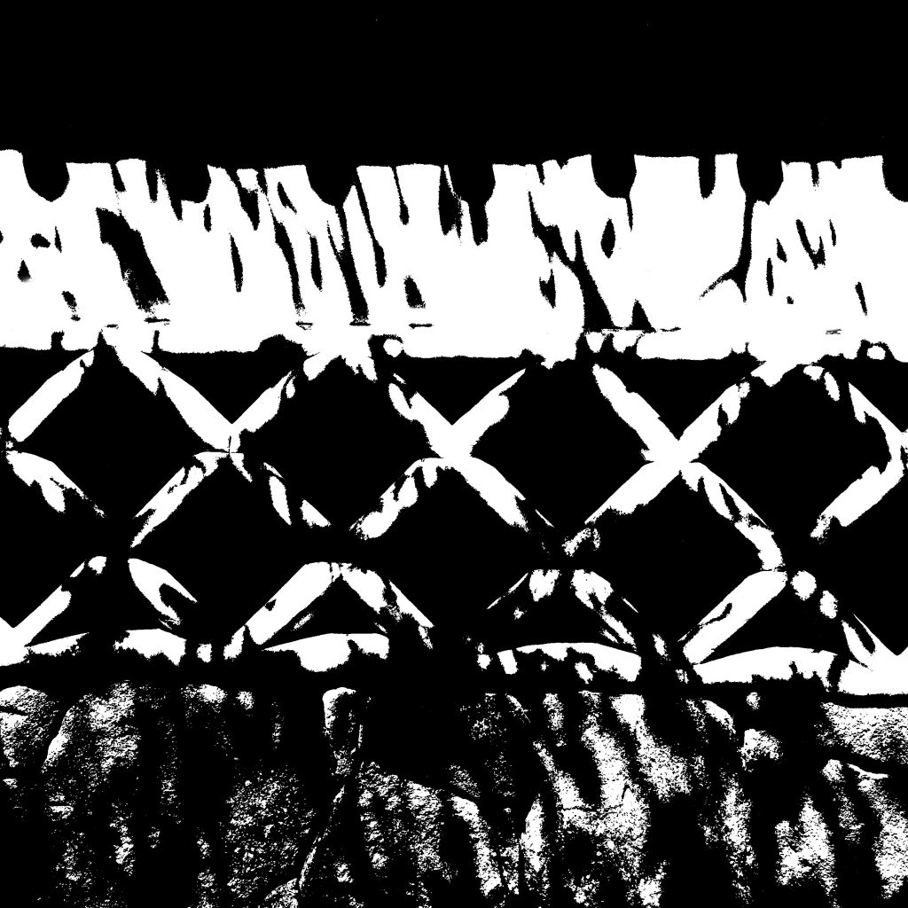
Wall in Hagi
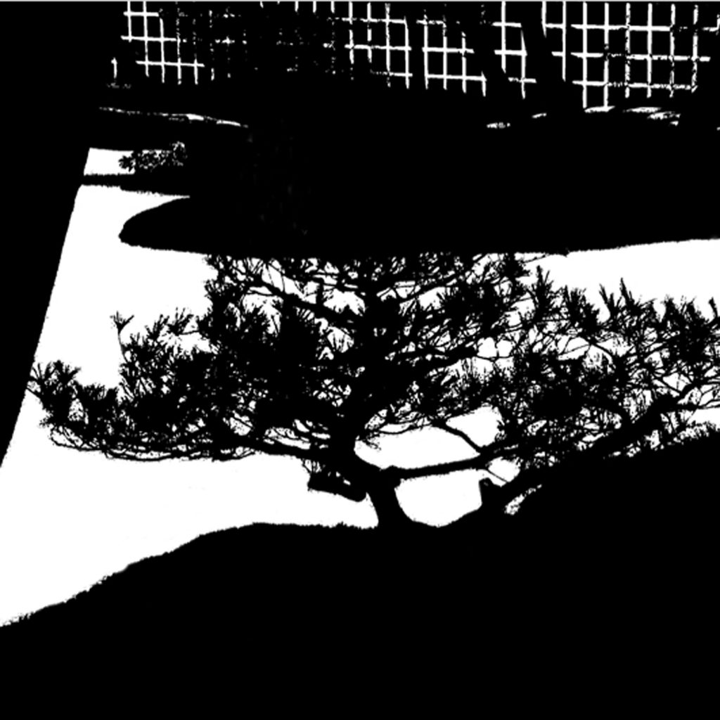
It enables one to perceive familiar sights with fresh vision
Ginkakuji Garden in Kyoto
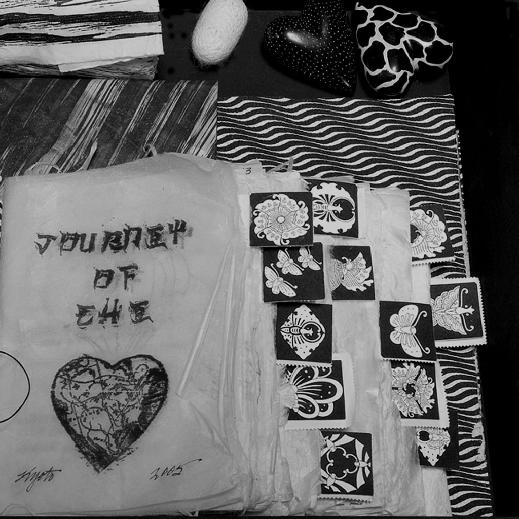
One of the most enduring examples of Notan are Mon
(family crests that adorn and identify a particular family or group)
Can you see how these principles have translated into
the contemporary development of the logo?
Mon are used as index markers to separate days
in this part of my Journey of the Heart Travel Journal…
a black and white assemblage made in response


Comments
Gorgeous imagery…. Black and white NOTAN essence of Japanese aesthetic you’ve captured it, gail.